
I regard Patrick Syme as one of the great unsung heroes of the Scottish Enlightenment. What? You’ve never heard of him? Precisely my point. And why, you may ask, should you have heard of Patrick Syme, minor painter of fruit and flowers, who, at the turn of the nineteenth century made his living teaching drawing to the daughters of the Edinburgh gentility? Well, we should all know about Patrick Syme because his work proved crucial to the perception, understanding and description of colour throughout the nineteenth century and beyond.

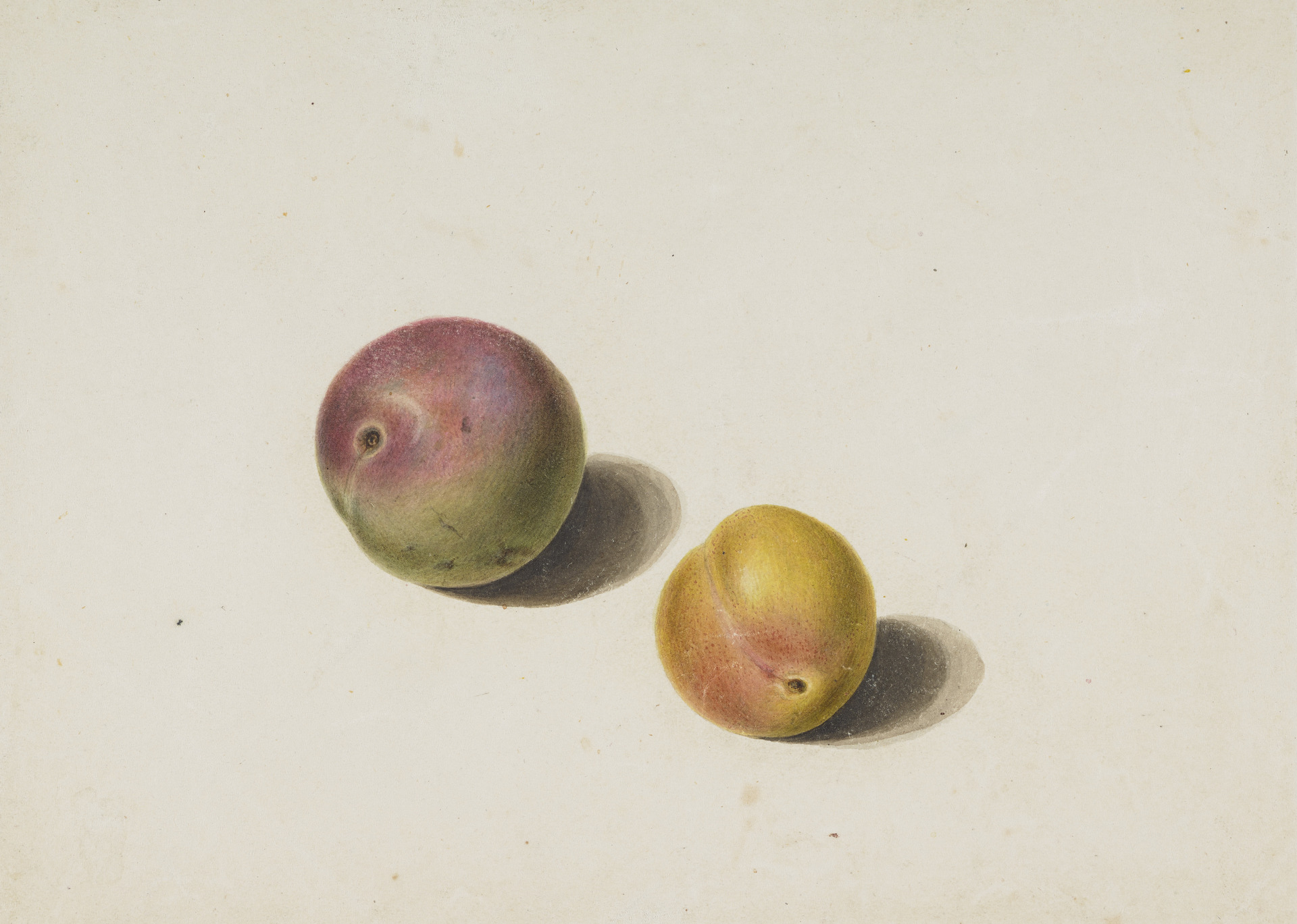
Born in Edinburgh in 1774, Patrick Syme was a talented young artist who quickly took charge of his brother’s well-established and successful business teaching drawing and painting to wealthy young ladies. Alongside his teaching practice, Syme was a keen student of botany and entomology, and became involved with several of Edinburgh’s thriving learned societies, including the Caledonian Horticultural Society, who appointed him as their dedicated painter of fruits and flowers.

In 1810, Syme published Practical Directions for Flower Drawing, which he described as a “useful guide to young ladies in the country who wish to learn flower drawings,” but later created something of a local scandal by eloping with one such young lady, Elizabeth Boswell, who as well as being one of his pupils and a talented watercolourist in her own right, was also the daughter of a wealthy and influential judge, Claud Irvine Boswell, cousin of James Boswell (of Boswell and Johnson fame)

In 1811, Syme was appointed painter to the Wernerian Society, another Edinburgh learned group dedicated to the advancement of knowledge in the then rather broad and overlapping fields of natural history, geology, mineralogy and botany. Established by Edinburgh professor Robert Jameson (who had studied with Abraham Gottlob Werner, father of German geology), the society published a scholarly journal, and, under Jameson’s lead, collected a huge collection of zoological and geological specimens, as objects of study.

It was in the service of the Wernerian Society, and in association with its attempts to classify, understand, and standardise the description of its expanding natural history collection, that Syme made his chromatic mark.

At the heart of the new “Wernerian” system, espoused by Edinburgh’s enlightened students of natural history, was the use of colour as a classificatory tool. In the eighteenth century, colour was not routinely used as a tool to divide and describe objects of study, and one of Abraham Werner’s scholarly innovations had been the development of a set of 54 standard shades with which mineralogical specimens might be identified.

Following Werner’s lead, Robert Jameson began to classify his Edinburgh collections using a “colour suite of minerals”, in which specimens were classified, arranged and displayed in chromatic shade order. Jameson developed new names and descriptors, and extended the number of “standard” shades in his “Wernerian” system to 84. Students of natural history found Werner’s and Jameson’s colour systems very useful, but their downside was that – unless you were lucky enough to have access to the actual specimen collections – such systems were entirely text based, reliant on descriptions rather than illustrations. Werner and Jameson had developed new nomenclatures of colour, that were, in themselves, completely colour-less.

Enter Patrick Syme, associate of Jameson’s, prominent member of Edinburgh’s Wernerian society, and an artist well-known and locally respected for his precise and meticulous renderings of the colourful variety of natural objects. Working with Jameson’s “colour suite of minerals” in the society’s Edinburgh collections, Syme studied and re-created each different shade, giving it a number and three different reference points in the natural world: not just mineral, but animal and vegetable.

As a talented and careful colourist Syme knew that he would have to create the illustrated samples for his nomenclature himself, rather than relying on what were then imprecise and unreliable methods of colour printing.

Thus each of the tiny swatches in every copy of the book that Patrick Syme eventually published, in Edinburgh, under the title of Werner’s Nomenclature of Colour (1814; 1821) were his own work: cut out from the gigantic sheets of paper which he had carefully painted in the precise shade referred to by each of his descriptors, and individually pasted in. Syme’s painterly-ness is evident in many of his shade names, which are drawn directly from artists pigments, such lake red and Gamboge yellow.

Syme’s nomenclature was the first to name and classify different shades of orange . . .

. . .and his range of greys and blacks is particularly extensive and precise.

The evocative poetry of Syme’s chromatic nomenclature is more than matched, in my mind, by that of his own painting: a practice which enabled the wide range of bluish neutrals in a pupae to be so beautifully rendered . . .

. . . or in which a group of peas and beans might sing in joyous celebration of the colour green.

A quintessentially Scottish enlightenment publication, Syme’s nomenclature was intended to serve primarily as a tool for knowledge, or an aid to effective communication: with a copy of his book to hand, someone might be able to to describe what they had seen or found in the natural world in terms that might be widely understood.

One such influential someone was Robert Jameson’s former student, Charles Darwin who carried his copy of Syme’s nomenclature with him on the Beagle voyages, and who “with book in hand” used Syme’s terms to describe the colours of his careful observations of the natural world: a “primrose yellow” sea slug, a coral glowing in “light auricular purple” a cuttlefish whose palette ranged from “chesnut brown” to “hyacinth red.”

Syme’s nomenclature went on to have a profound influence upon later colour systems, such as those of Smithsonian curator Robert Ridgway, from whose 1912 Color Standards modern commercial practices of colour matching, such as those of Pantone, took their lead.

Syme is often described as the “translator” of the work of Abraham Gottlob Werner, but really, he was a creator and innovator very much in his own right: a figure at the heart of enlightenment Scotland, whose vision of the colourful variety of the natural world still affects our chromatic understanding (and vocabulary) to this day.

Further reading
Explore the National Gallery of Scotland’s collection of Syme’s works here and an original (digitised) copy of his Nomenclature of Colour at the Royal Scottish Academy here.
I highly recommend the beautiful Thames & Hudson volume Nature’s Palette, which includes a couple of great essays about Patrick Syme by Giulia Simonini and Peter Davidson (of the National Museum of Scotland)
Leave a Reply to Jessica BA Cancel reply