
This collection is organised around two design themes. The first is maritime texture, of the twisted stitch and cable kind . . .

. . . and the second is colourwork of a style and palette I would describe as unashamedly nostalgic.

I often put together a moodboard, or collection of visual images, which I have in mind while I’m working on a collection. These images help me both with the designing and the styling. This one, by Ladybird children’s book illustrator, Clive Upton, stood out to me while I was working on Davaar. Crashing waves and a high cliffside. A beckoning coastal path that must soon be left behind. Red socks. Blue matelot. Yellow dress. August’s blown, worn greens. There are a few colourwork designs in this collection, all using this same palette of nostalgic, muted primaries.

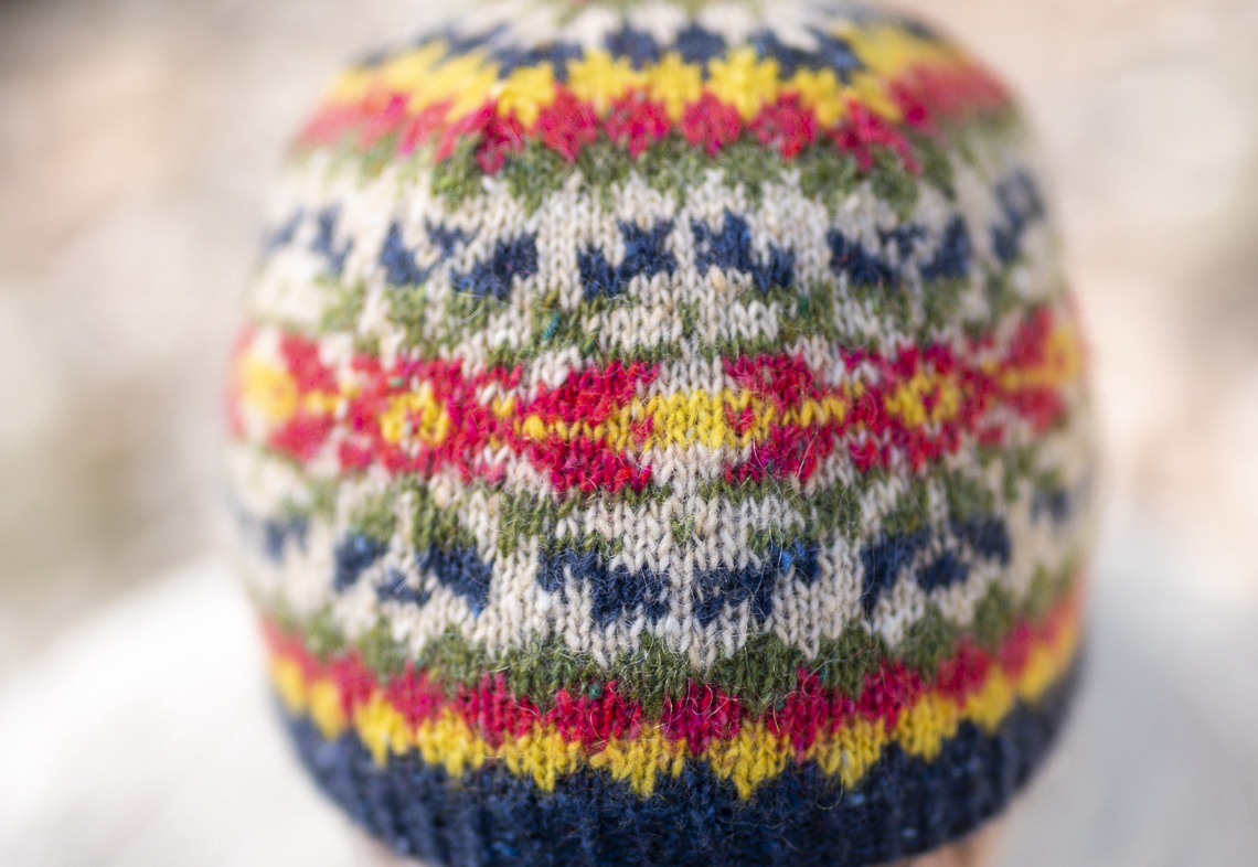
I’ve also used this diced motif, which you find a lot of in vintage Shetland knitwear, particularly in glove and sweater designs of the 1950s. Like Upton’s palette of muted primaries, this simple motif somehow has an immediately nostalgic feel for me. In The Doirlinn mitt design, the dicing covers the whole hand and flip top . . .

While in the MacKinnon hat, the dicing surrounds a larger star of the familiar Norwegian kind – a motif which had begun to find its way to Shetland (and into colourful Shetland knitwear) during and after the Second World War.

The large motif creates a broad band around the body of the hat

. . . and the dicing works well to create a starry crown.

The design is named MacKinnon, after Archibald MacKinnon, the resourceful artist who created Davaar’s famous painted cave.

I’ve really enjoyed researching – and writing about – MacKinnon and his interesting story

. . . of which you can read more in the Davaar book itself.

MacKinnon is my kind of hat, and it’s my attempt to capture, both in palette and motifs, the distinctive end-of-summer nostalgic feeling that I somehow associate with Davaar. I hope that you enjoy it!

Leave a Reply