Hello. It’s Tom here. Kate is sat outside knitting a new design (and muttering something about modified raglans), so I thought I’d chip in here for once. When I’m not busy taking photos or handling day to day business matters, I’m responsible for the graphic and design work here at KDD – creating everything from labels to book layouts. I thought you might be interested to see how I developed the logo for Kate’s new yarn, Milarrochy Tweed (which will be released later this year).

Many of you will be aware of Kate’s long-standing fondness for this oak tree. It grows on the eastern shore of Loch Lomond – a short distance from our home. We often take Bruce here, and the circuit between Balmaha and Milarrochy is one one of our favourite everyday walks.

Here I am, with Bruce, by the tree, back in 2015.
Kate’s new yarn is inspired by the colours of our local landscape, and she knew from the start she wanted to associate it with the Milarrochy Tree. So she asked me to create a new logo, in which it featured.
The logo had to fit in with others we’ve developed. These are monochrome, use sans serif fonts, and feature strong and simple graphic shapes like triangles . . .

. . . and swirls.

![]()
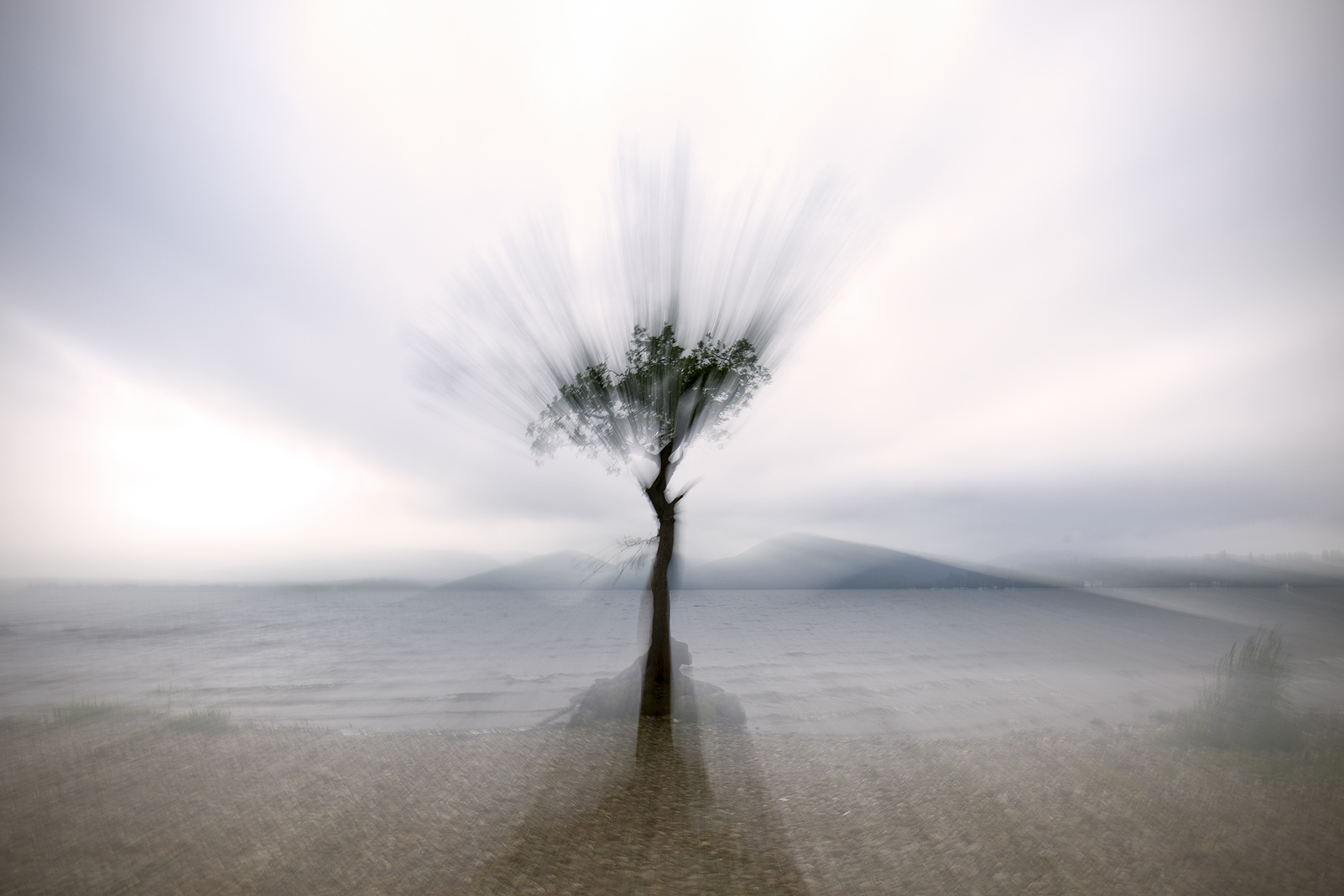
So I began by looking at the tree itself, and then at images of it. Luckily, there is no shortage of Milarrochy tree photographs around here!

I found that several of my photographs, in which the tree was depicted in winter, backlit, with bare branches, had had a structural, graphic quality that I liked

So I selected my favourite, removed much of the detail from it, and used this as the basis of an artboard in Illustrator.

I began overlaying the image with triangles, a bit like the ones I used for the Buachaille logo

But I didn’t think these worked so well

So I then moved onto experimenting with swirls, like those used on the KDD logo.

My initial attempts were far too complicated – less is definitely more!

One of the really interesting things about the Milarrochy tree (like many things that grow naturally) is the way it achieves its own sort of balance through asymmetry. Its trunk is irregularly shaped, its branches and roots are twisted, and yet, when you look at its shape as a whole, there’s an extraordinary formal harmony about it.

This formal coupling of balance and asymmetry in the tree is what I wanted the logo to really capture. It took many failed attempts, and lots and lots of tweaking, before I finally devised a logo I was happy with.
![]()
I hope you like my logo as much as I’m sure you’ll like the yarn (which Kate will tell you more about soon).

While I’m here, I have to mention Ootlier issue 1, which has just been published. Every year, a few miles away from where we live, the Drymen show has been held since 1816. It’s Scotland’s longest-running one-day agricultural event, and is an amazing local spectacle – particularly famous for its displays of Clydesdales and other draught horses.

Back in Spring, I got in touch with Drymen’s organisers and spent an interesting week photographing the hard work of the people who make the show happen . . .

Before capturing images of the show itself.


I asked Kate to do some research about the history of the show, and to write an introduction.

Then I put it all together, as a nicely produced small book, and sent it to our printers, Bell and Bain.

We are lucky to live in a beautiful place which I enjoy photographing. But one of the key aims of my photography is to represent Scotland as what it really is — a working landscape, not a picturesque wilderness. The Drymen show is a highlight of our local agricultural year, and I am proud to be able to make it the subject of the first issue of my zine.

If you are interested seeing and hearing more about the Drymen Show, Ootlier issue 1 is now in the shop.. And if you’d like to see more of my photographic work, you’ll find it here.
Thanks for reading,
Tom

Leave a Reply to rockandwool Cancel reply