
Hello. It’s Tom here. Kate is sat outside knitting a new design (and muttering something about modified raglans), so I thought I’d chip in here for once. When I’m not busy taking photos or handling day to day business matters, I’m responsible for the graphic and design work here at KDD – creating everything from labels to book layouts. I thought you might be interested to see how I developed the logo for Kate’s new yarn, Milarrochy Tweed (which will be released later this year).

Many of you will be aware of Kate’s long-standing fondness for this oak tree. It grows on the eastern shore of Loch Lomond – a short distance from our home. We often take Bruce here, and the circuit between Balmaha and Milarrochy is one one of our favourite everyday walks.
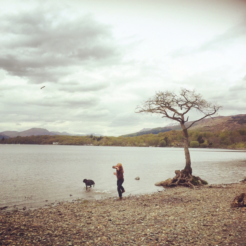
Here I am, with Bruce, by the tree, back in 2015.
Kate’s new yarn is inspired by the colours of our local landscape, and she knew from the start she wanted to associate it with the Milarrochy Tree. So she asked me to create a new logo, in which it featured.
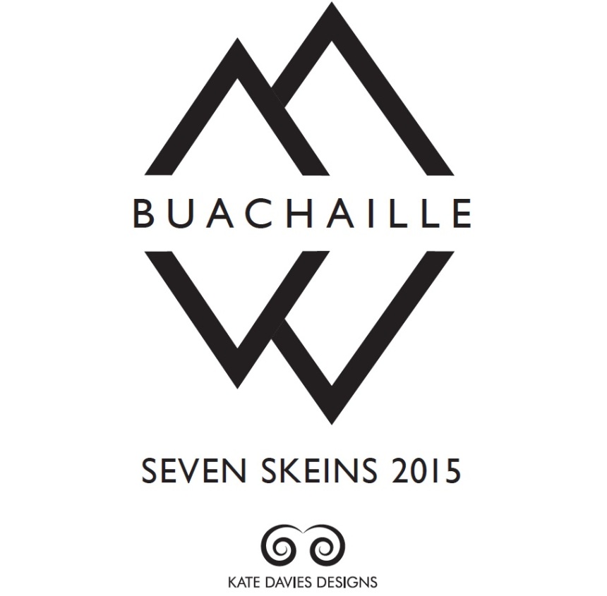
The logo had to fit in with others we’ve developed. These are monochrome, use sans serif fonts, and feature strong and simple graphic shapes like triangles . . .
. . . and swirls.

![]()
So I began by looking at the tree itself, and then at images of it. Luckily, there is no shortage of Milarrochy tree photographs around here!

I found that several of my photographs, in which the tree was depicted in winter, backlit, with bare branches, had had a structural, graphic quality that I liked

So I selected my favourite, removed much of the detail from it, and used this as the basis of an artboard in Illustrator.

I began overlaying the image with triangles, a bit like the ones I used for the Buachaille logo

But I didn’t think these worked so well

So I then moved onto experimenting with swirls, like those used on the KDD logo.

My initial attempts were far too complicated – less is definitely more!

One of the really interesting things about the Milarrochy tree (like many things that grow naturally) is the way it achieves its own sort of balance through asymmetry. Its trunk is irregularly shaped, its branches and roots are twisted, and yet, when you look at its shape as a whole, there’s an extraordinary formal harmony about it.

This formal coupling of balance and asymmetry in the tree is what I wanted the logo to really capture. It took many failed attempts, and lots and lots of tweaking, before I finally devised a logo I was happy with.
![]()
I hope you like my logo as much as I’m sure you’ll like the yarn (which Kate will tell you more about soon).

While I’m here, I have to mention Ootlier issue 1, which has just been published. Every year, a few miles away from where we live, the Drymen show has been held since 1816. It’s Scotland’s longest-running one-day agricultural event, and is an amazing local spectacle – particularly famous for its displays of Clydesdales and other draught horses.

Back in Spring, I got in touch with Drymen’s organisers and spent an interesting week photographing the hard work of the people who make the show happen . . .

Before capturing images of the show itself.


I asked Kate to do some research about the history of the show, and to write an introduction.

Then I put it all together, as a nicely produced small book, and sent it to our printers, Bell and Bain.

We are lucky to live in a beautiful place which I enjoy photographing. But one of the key aims of my photography is to represent Scotland as what it really is — a working landscape, not a picturesque wilderness. The Drymen show is a highlight of our local agricultural year, and I am proud to be able to make it the subject of the first issue of my zine.

If you are interested seeing and hearing more about the Drymen Show, Ootlier issue 1 is now in the shop.. And if you’d like to see more of my photographic work, you’ll find it here.
Thanks for reading,
Tom


the logo is great! looks readable and surreal at the same time
LikeLike
You are King of the Logos indeed, Tom! Your landscape photos bring back happy memories of a week in 1980 spent hiking around Loch Lomond.
LikeLike
Super nice project:)
LikeLike
It only shows that you loved what you are doing Tom!, you made a good work. I loved to see more for my product photographyideas that you are going to share with us!. Thank you so much.
LikeLike
Wow, these are some beautiful photographs! Amazing work.
Do you mind if I sometimes use them in my blog? (with credits to you of course)
LikeLike
Fascinating Tom. I so enjoyed reading how you devised your logo. I’m a Glaswegian by birth and upbringing and now live in East Yorkshire but I know your area very well. Where we live we also have many local agricultural shows and the Driffield show is reputedly the biggest one day show in England, with over 25000 visitors each year. I thought Kate would like to know that I recently knitted the Uncia from the Book of Haps in Fyberspates Vivacious (copper tones) and entered it for Driffield show. Guess what, I won first prize in the class I entered and a rosette for best knitting. I was thrilled.
LikeLiked by 2 people
Congratulations Karen on a well knit beautiful Unica. A treasured rosette is yours forever.
LikeLike
Many congratulations on your rosette, Karen! I know the Driffield show very well.
LikeLike
Beautiful photographs, Tom. I very much enjoyed seeing the process of how you came to the final design for the new logo. Looking forward to seeing more of your work!
LikeLike
Interesting post. I enjoyed seeing your design process and the pictures of the Dryman’s show.
LikeLike
Thanks Tom, great post.
LikeLike
Thanks for sharing your process! Wonderful – all of you (Bruce included). :-)
LikeLike
Beautiful job on the logo! Can’t wait ti see the product. Do enjoy your photos so much–what a talented team you are!
LikeLike
Tom…how wonderfully interesting! Thank you for sharing your design and thought process with us. I love hearing from you, Kate and Bruce.
Julie
LikeLike
I just love seeing the process you took Tom to arrive at the finished logo! Great job!
LikeLike
Love the simplicity of the final logo Tom. Fascinating to see its evolution.
LikeLike
Love the logo Tom and fascinating to see the stages in its evolution.
LikeLike
Defurrnitely on a winner with that logo – hold on while I climb the tree so I can watch Bruce getting wet. (We cats prefer to keep our paws dry.
LikeLike
Love the new logo. I think the very simple version would also make a beautiful silver brooch or shawl pin. As always the photos are stunning.
LikeLiked by 2 people
Thanks for chipping in. I enjoyed seeing your design process and reading about the Drymen show.
I was in the Loch Lomand area in March and can just begin to understand yours and Kate’s love of the area.
Rebecca
LikeLike
Lovely! Thank you for sharing your design process with us, Tom. I agree that “less is definitely more” when it comes to graphic design. In fact, when driving, my partner and I often comment about overly-complicated signs on vehicles or in shop windows: “It’s nice, but it’s not a 60 m.p.h. design.” I also loved the photos from the Drymen show, especially the one of what I assume was a mother Highland Cow and her baby.
LikeLike
Tom, thanks so very much for explaining your design process. I love the newest logo, and all of them. Looking forward to receiving my copy of copy of your very first issue of Ootlier. Your photos are always very inspiring! Thank you!
LikeLike
MERCI à Tom pour la belle histoire de ce logo génial et pour ces photos absolument SU-PER-BES en noir et blanc et en couleurs… les paysages sont magnifiques ! et la photo du cheval de Drymen… WOW ! Bon courage à Kate pour son tricot ! Hi Bruce, I love you ;-)
LikeLike
j’aime , j’aime , j’aime !!!!!!
LikeLike
I DO like the new logo, yes, less is more. I would have also liked the stripped down version of the tree. MY sister raises Clydesdales and it was nice to see that draft horse all kitted out. Nice post, thank you for chipping in!
LikeLike
It was fascinating learning about your design process and seeing so many of your photographs. You are an amazing photographer and graphic designer. Thanks for sharing how some of this works.
LikeLike
Thanks for sharing your design process. It is so helpful to hear how other creative people create. You captured the feminine essence of the Milarrochy Tree. Loved see the pictures of the Dryman Show.
LikeLike
Thank you Tom for your commentary about your most interesting design process. I am a big fan of your beautiful photos always. Your eyes give a lot to all of us. Many years ago I was fortunate to have visited your beautiful country and visit Loch Lomond. Please try to capture Nessy for us too! I very much enjoyed viewing the Drymen Fair through your eyes. Thank you very much for all…
LikeLike
I love how each of you share your process in your creations.
Also love learning about the land you so love.
LikeLike
Thank you for the article, I really enjoy reading what creative people share about their “behind the scenes” work and I think the logo turned out great. Here´s one more photo for your collection from our WHW holiday in 2014: http://aconita.sweb.cz/jine/IMG_8353.JPG. We fell in love with the Milarrochy oak as well!
LikeLike
You portray the idyllic landscape with love and finesse. Love your photography—inspirational for us
amateurs! The logo is super and I’m drooling with anticipation for the new yarn!
LikeLike
Tom. Did you notice the first tree/swirl design looks like a women upside down. Wonderful photos.
LikeLike
Great job – as usual! My Mother graduated at age 78 with a computer graphics degree and I remember all the steps she would go through to get it just right. Patiently waiting for the new yarn, it sounds wonderful. I sure would like to get one of those canes – a touch of whimsy to bring a smile when you are gimping along.
LikeLike
I love am an embroiderer and found your website while looking for Isle of Skye inspirations. I have ancestors from there and love looking at the scenery. Where I live in the US raises Clydesdale horses for Anheuser Busch, so we have seen them in parades and at Busch Gardens in St. Louis. Your Ootlier book looks like a wonderful documentation of a time honoured event, georgeous in its simplicity. I have passed on your blog to many of my artist friends who love it. Thanks to both of you for brightening up our world!!!
LikeLike
Nice!
LikeLike
::::101 thank yous::::
Both of you make our world a better place!
LikeLike
Love the new logo. It seems to be an image with classic lines that would last forever, much like the tree. And what a great book – Ootlier – to document a long held traditional fair for all of us to learn about. Thank you Tom.
LikeLike
Stunningly beautiful!
LikeLike
Do love the new logo! When is the the Dryman show? The photos are beautiful! Thanks
LikeLike
Wonderful job on the new logo, Tom, and I really enjoyed reading about your process in designing it.
LikeLike
Thank you Tom for sharing this with us. I am always fascinated by the development of logos, and the Genesis of this one is superb. And I love the way you two work together. It is a true blessing to be in a partnership where together you can achieve far more than you could separately, and when the skill of one complements the gifts of the other.
LikeLike
Thank you Tom for a wonderful read.
LikeLiked by 1 person
It’s a beautiful thing!
LikeLiked by 1 person
Beautiful…..just beautiful! Love the post! Such an enjoyable read! Thank you!💕
LikeLiked by 1 person
The logo is lovely, as is all your work, can’t wait to see the yarn. Always feel a kinship here, my Nana was born in Linlithgow.
LikeLiked by 2 people
Love Linlithgow. Stayed there in 2014 for 13 days. Beautiful! Very fond memories.
LikeLike
Love the logo and your beautifully stunning photographs Tom
LikeLike
… I hope the beautiful blurred photo of the tree will make it into the outlier gallery? I’d like to hang it beside the crisp winter one.
LikeLike
Hi Mhairi, it’s available here:
http://photos.ootlier.com/gallery/shetlandoo/album/3027076/photo/599685535
LikeLike
Thanks Kate … will visit and buy soon.
LikeLike
Wow.. to the entire post. I think the logo is stunning, and love to read how you came to design it.
All the photographs are beautiful, too, thanks for sharing it all !
LikeLike
Elegant and yet somehow anticipating the ‘nubbly ‘ texture that I am so looking forward to. I love knitting with buachaille but am itching for some lovely new fingering wool – 12 shades too!
LikeLike
Thank you Tom. I really admire the way you and Kate connect with your landscape and manage to communicate it to those of us who live too far away to be able to experience it directly.
LikeLike
Thanks for sharing how you devised the logo…love it. The photos are great too, you are very lucky to live in such a beautiful place, it shines through in your photographs…..
LikeLike
It is really interesting to see how you progressed your design from complicated to simple so comprehensively. You have caught the spirit of the tree in just a few strokes that are the Milarrochy Oak, lovely. I love to see your work, it marries in with Kate’s work so very well and yet is also totally separate from it as well.
LikeLike
Gorgeous photos and lovely to see how your design evolved.
LikeLike
Very much enjoyed reading this, thank you
LikeLike
Fascinating tom the design of the new logo and the story of your zine you are both so talented and generous in sharing with the rest of the world thankyou
LikeLike
Lovely photos (as always) and very interesting to see how the new logo came to be!
LikeLike
Brilliant photos Tom, fascinated to see how you developed your new logo. Inspired to get out and about with my camera!
LikeLike
Outstanding images from your beloved landscape. Loved to see how the logo developed and was designed. Simply beautiful.
LikeLike